
Vinyl Packaging

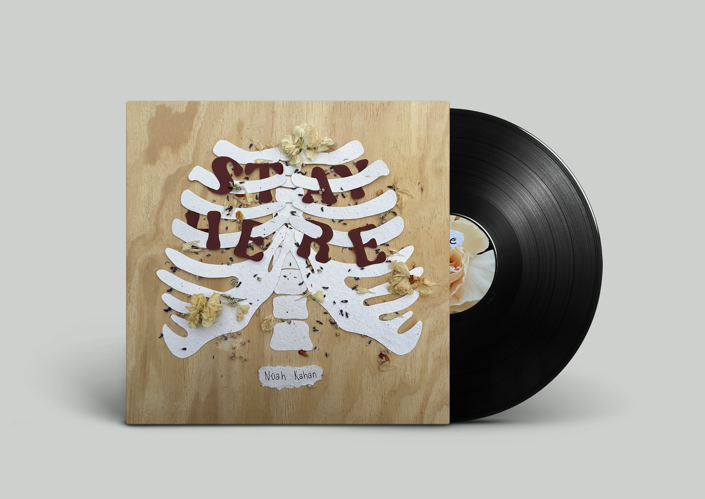
This Vinyl Design was created for a type class I took at Penn State. The goal was to create and use physical design to execute a packaging for a Vinyl Record.
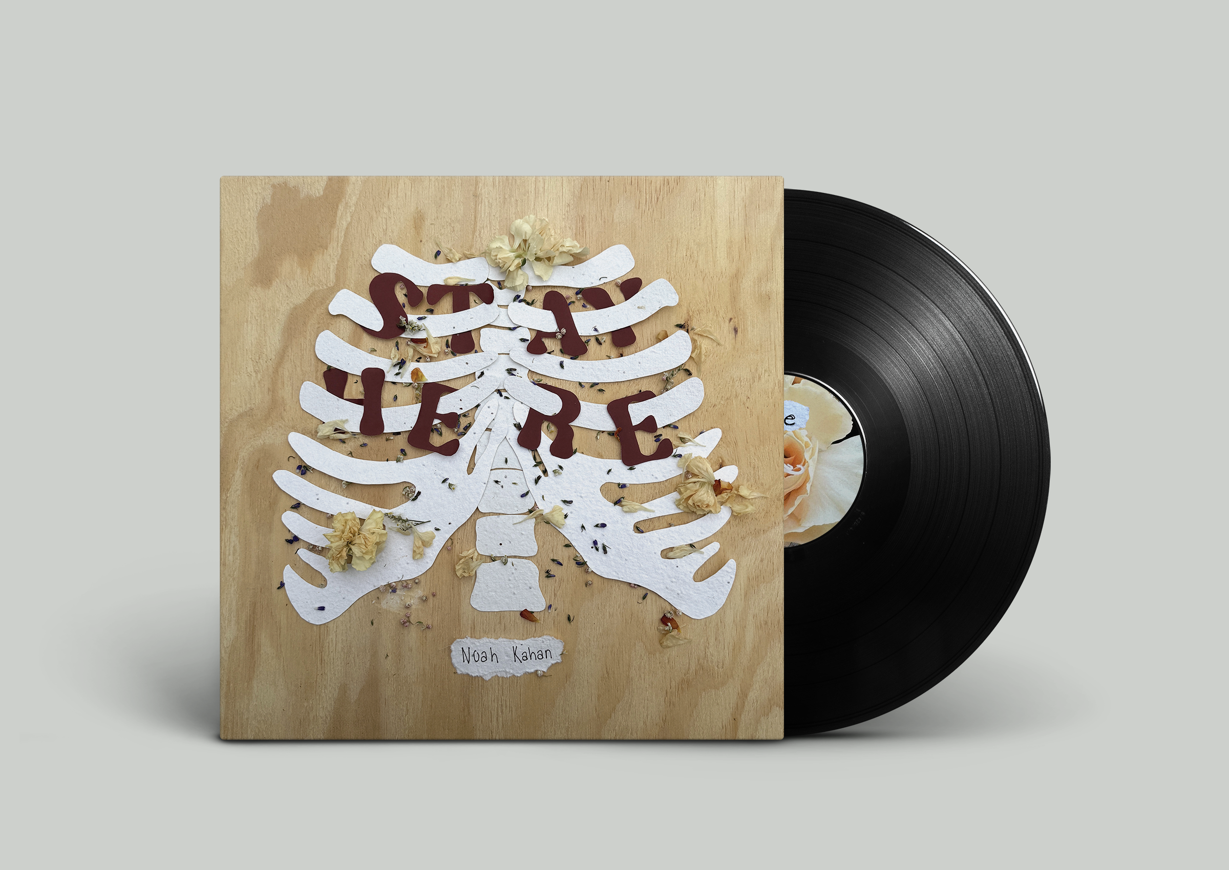
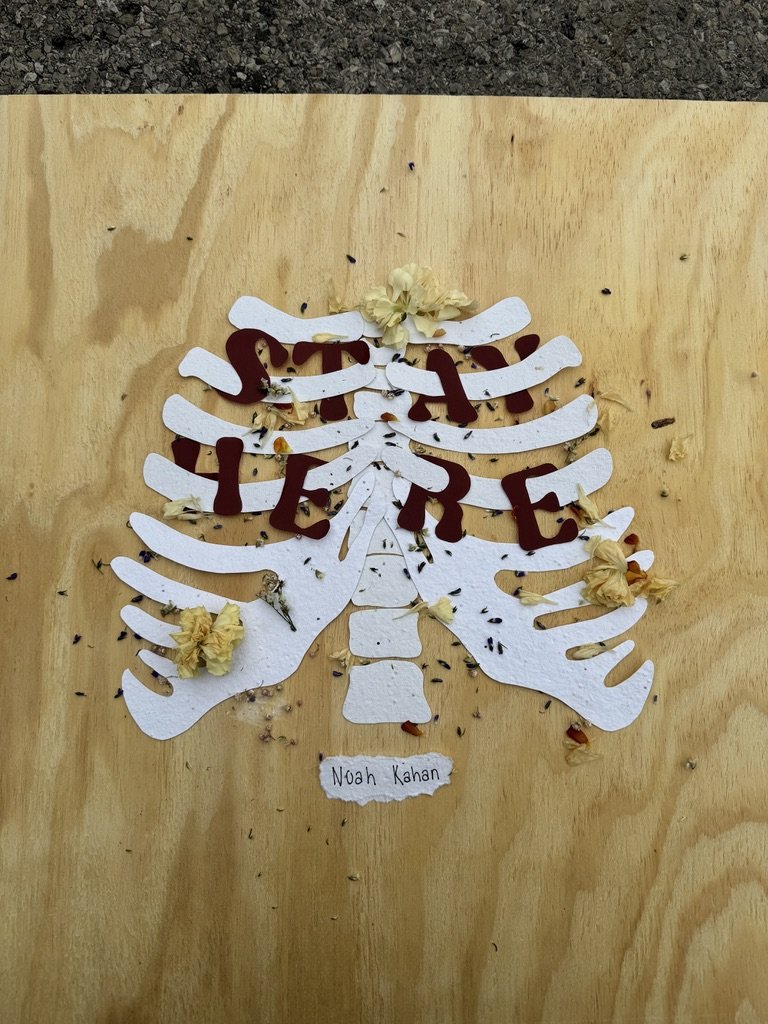
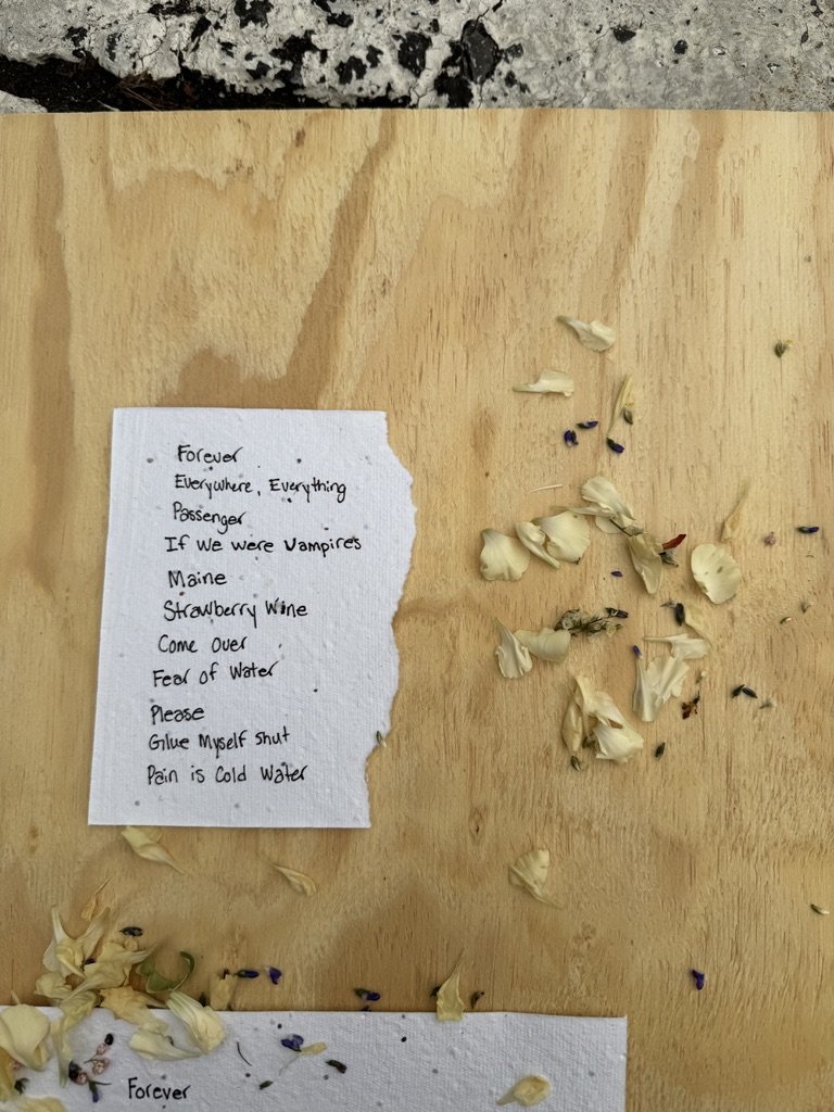
The artist I chose to highlight was Noah Kahan and I themed my packaging around themes of Love and Loss that are found throughout his music. For the title of the album I chose “Stay Here” and chose a selection of songs that represented either love or loss.
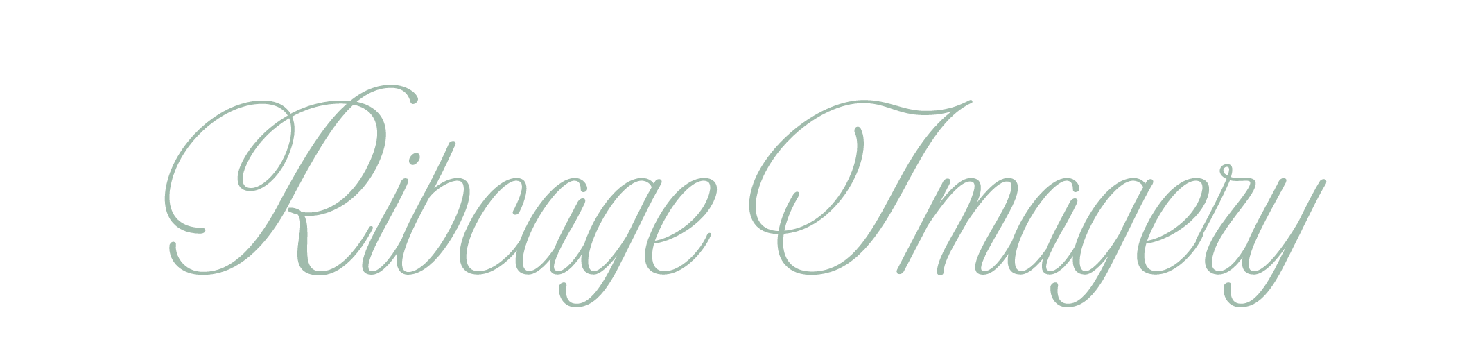
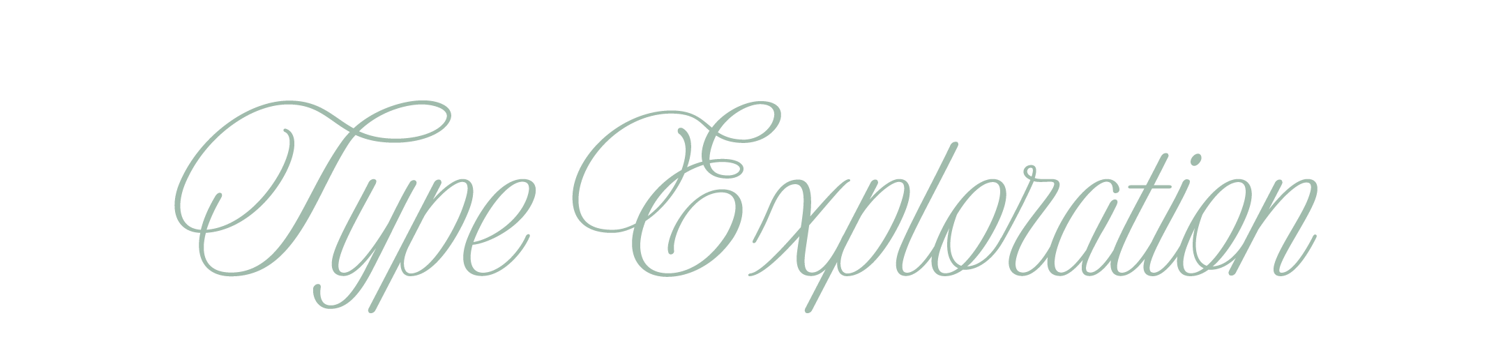
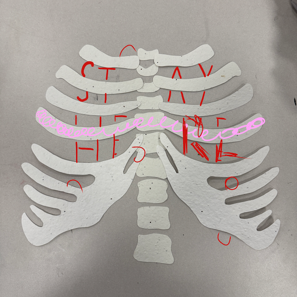
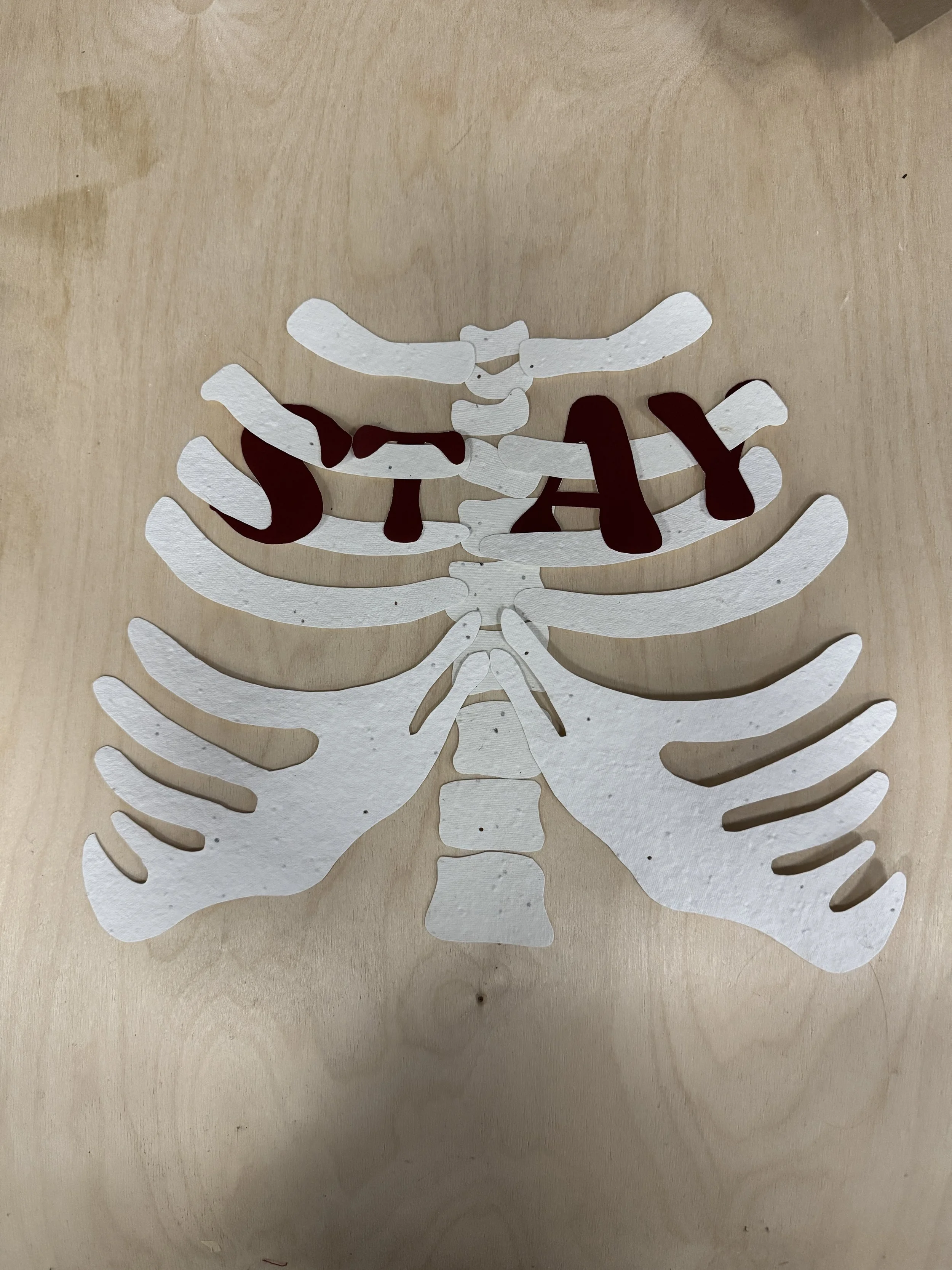
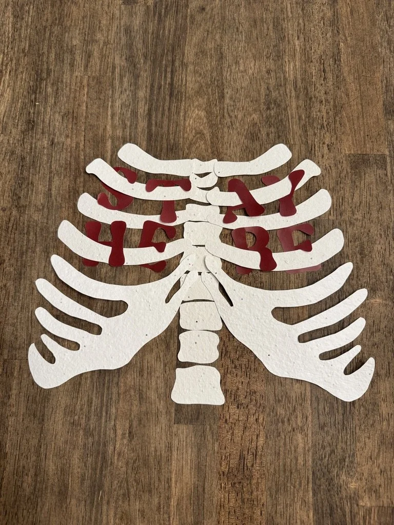
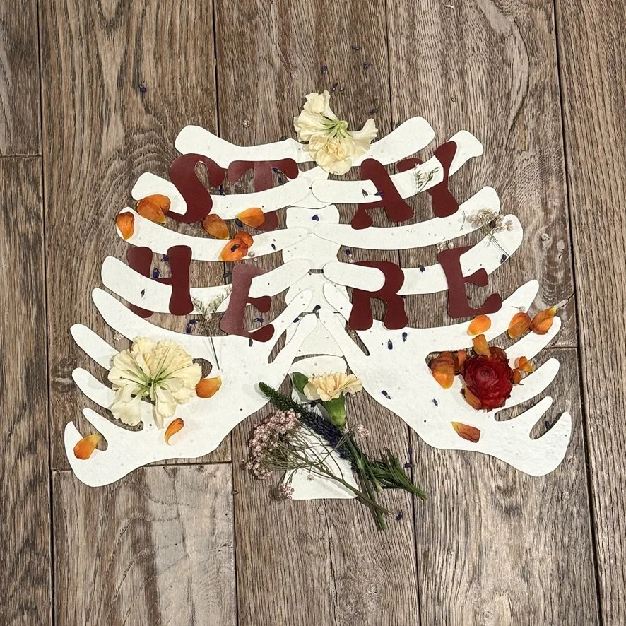
When doing font exploration I decided I wanted the words to weave in and out of the ribcage so they felt intertwined.
I thought this concept fit the idea of “love and loss” because sometimes the want for someone to stay can feel intertwined in your body.
The typeface I chose for the actual wording was “Nighty.” I liked the way the type itself was very organic and folk styled.
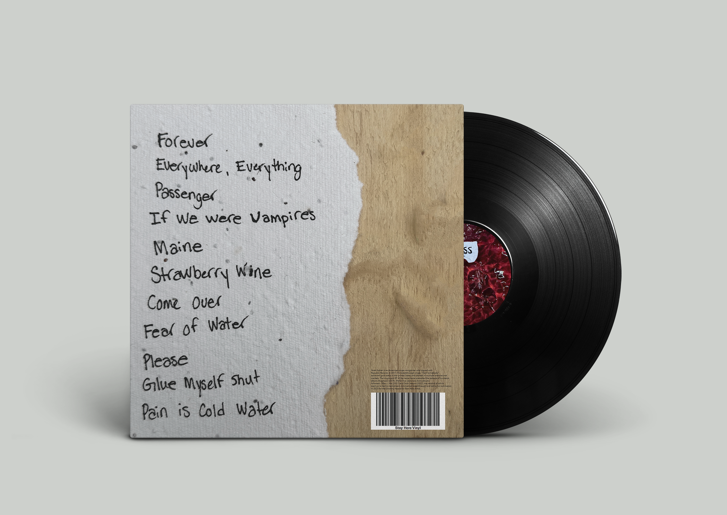
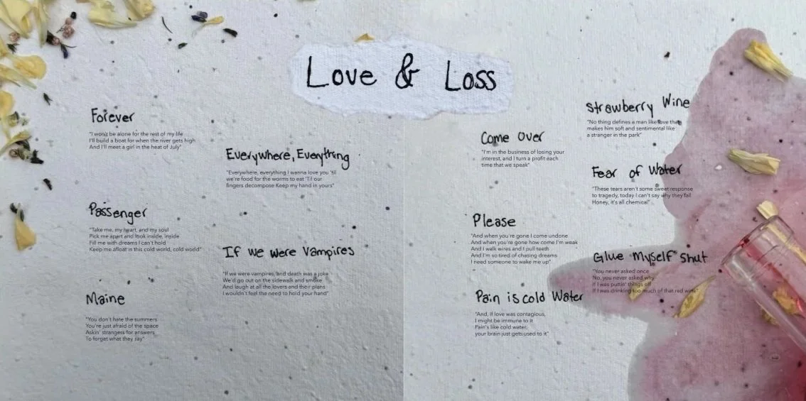
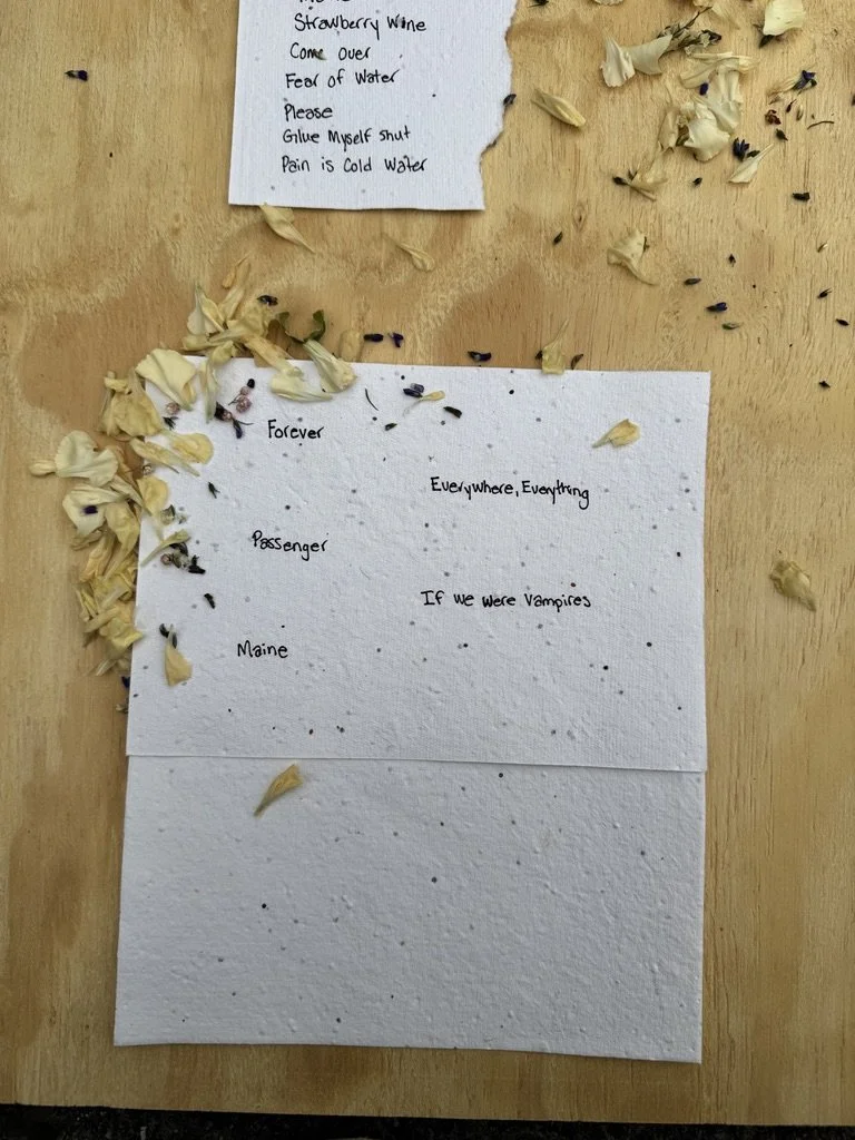
My project included other wording that was all completed by hand to make it feel more personal.
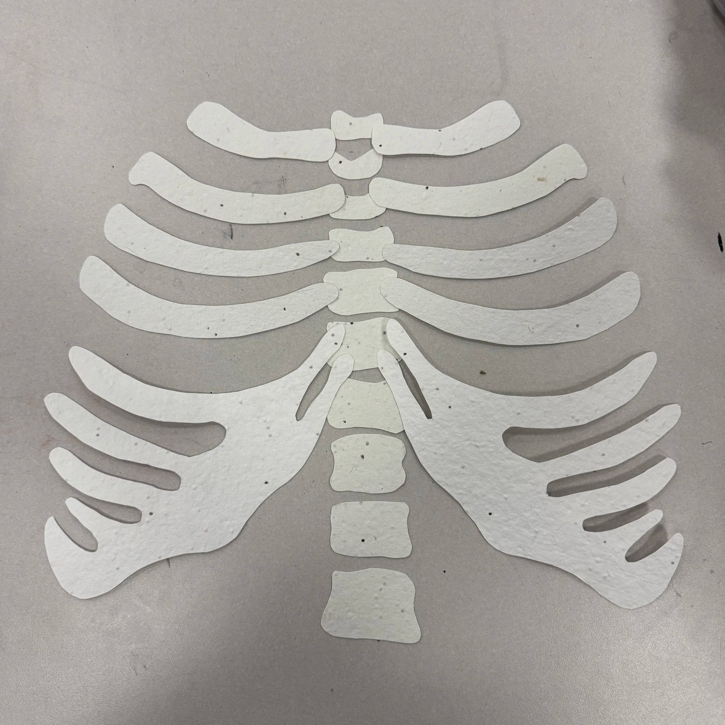
The main imagery for the front of my album cover is a ribcage. This idea came to me from one of Noah Kahan’s Lyrics in the song “Everywhere, Everything” where he says, “wanna love you ‘till we’re food for the worms to eat.”
I loved the idea of love and loss both being represented by bones, the physical center of who we all are. I chose the ribs because they are very attached to the poetic imagery of love since they are the literal protection of the heart.
For the creation of the ribcage I used seed paper. It has a very natural and grainy aesthetic which matches Noah Kahan’s general aesthetic, and on a deeper level, I wanted the ribs to represent growth, which Noah Kahan speaks on often.

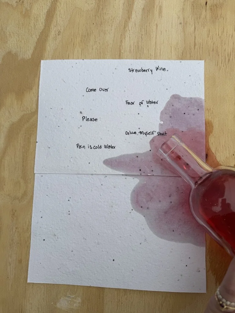
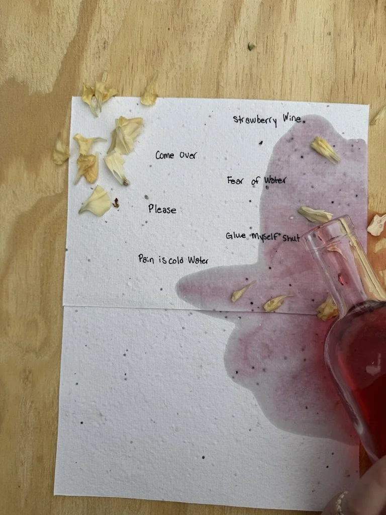
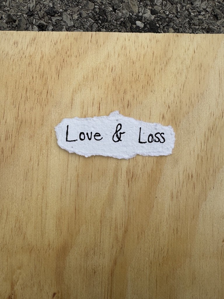
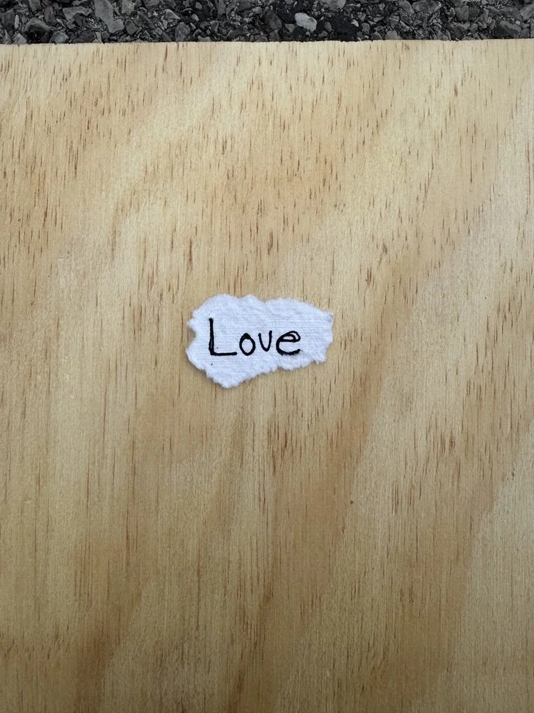
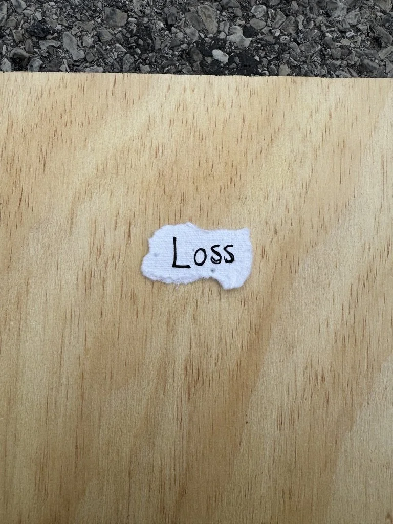
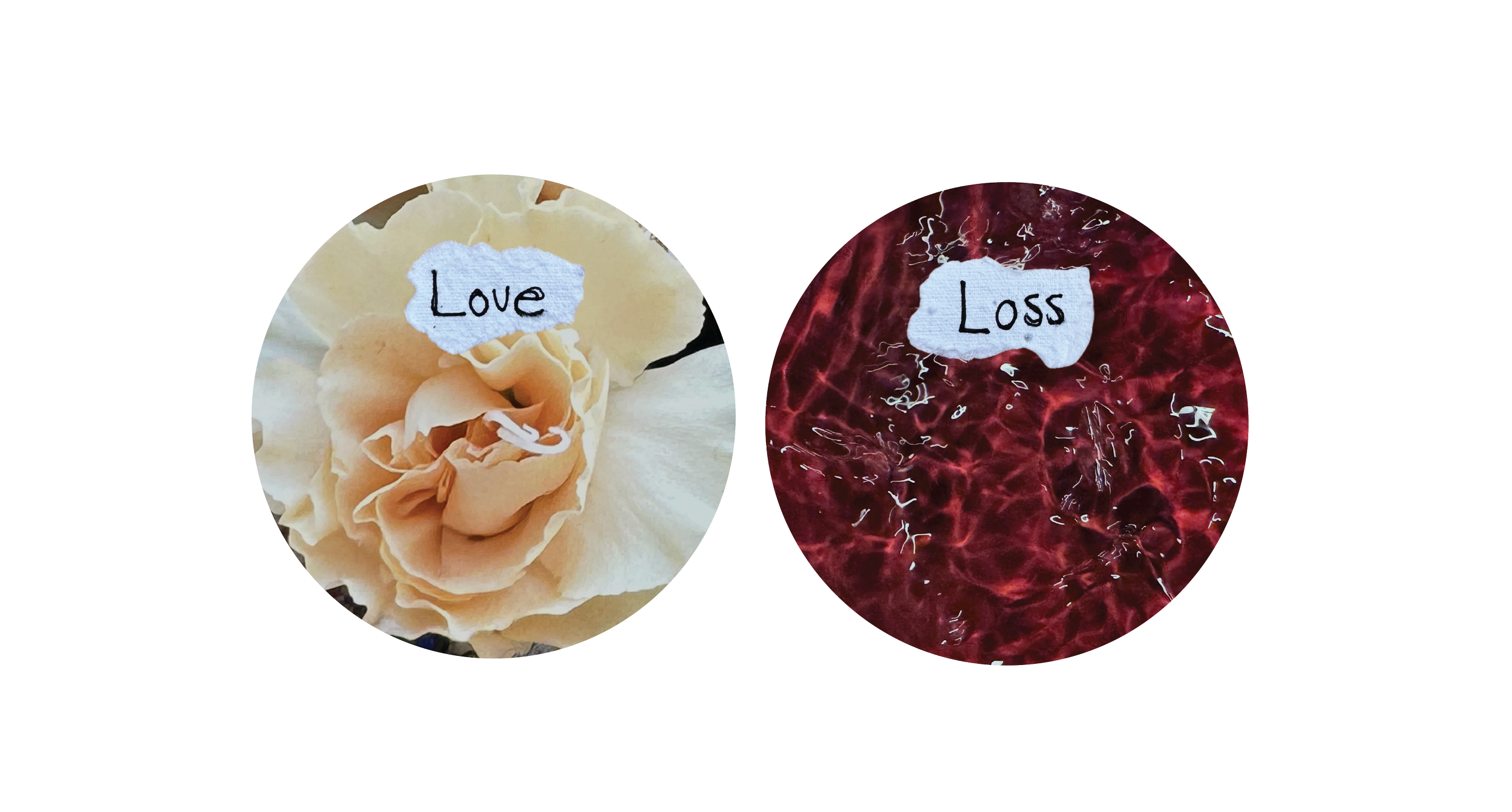
Another part of the packaging we had to explore was the stickers on the Vinyl. I used imagery I had photographed earlier in the project when I was exploring different concepts to tie together the idea of love and loss.
The tracks were split on the record with one side being love songs and one side being songs about loss and it is labeled as such on the physical record.