Coffee Shop Branding Exploration

For this project I decided to go back to an old project to reimagine it. January 2025 I attempted to make a design for a fairy-aesthetic coffee shop that specialized in herbal teas and unique coffee flavors. After dropping the personal project due to a busy schedule and design block, I decided to pick it back up while taking GD 405 at Penn State for my Minor Capstone.

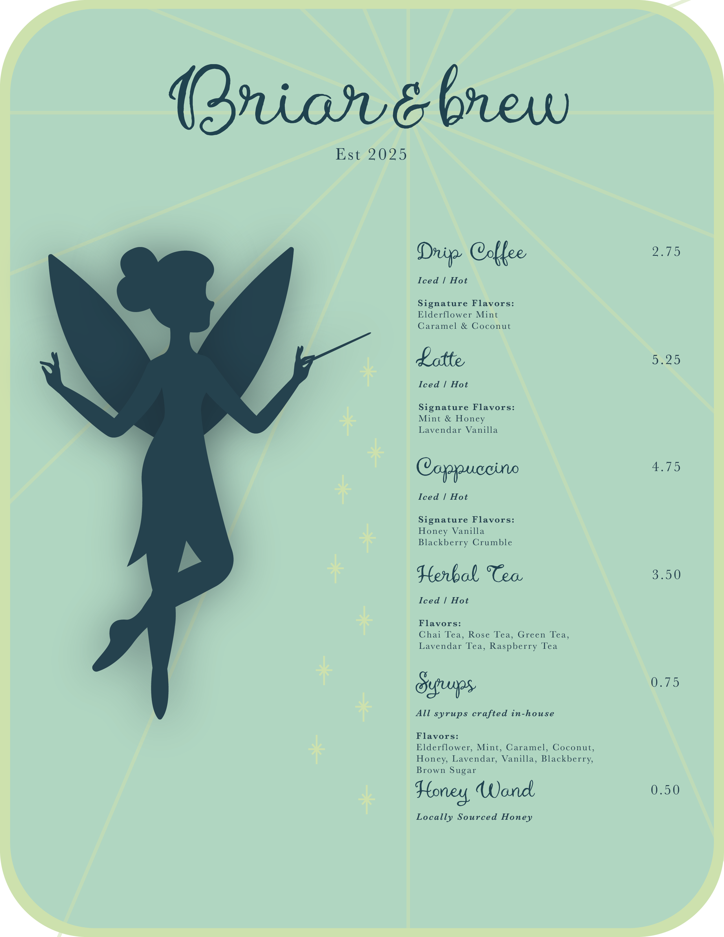
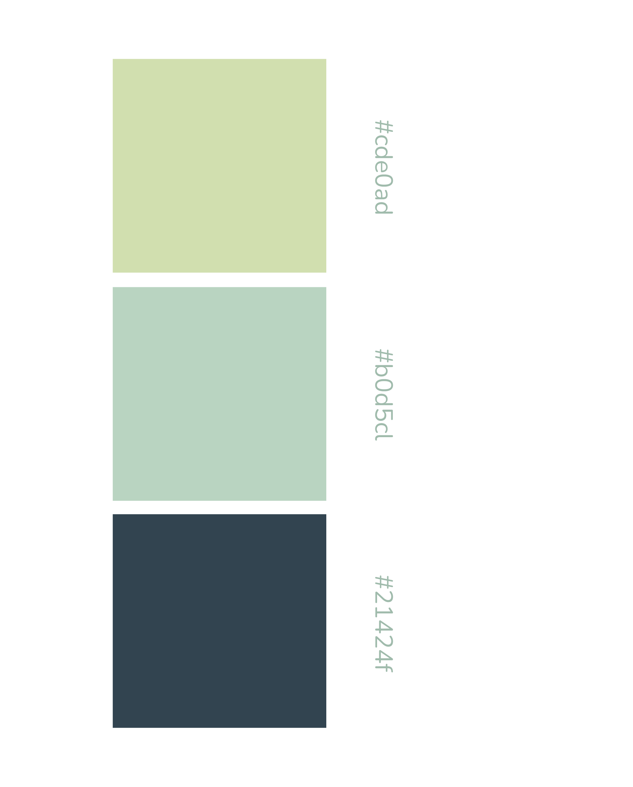
For my Color Palette I decided to go with a scheme of greens which includes a lime, a sage, and a dark teal.
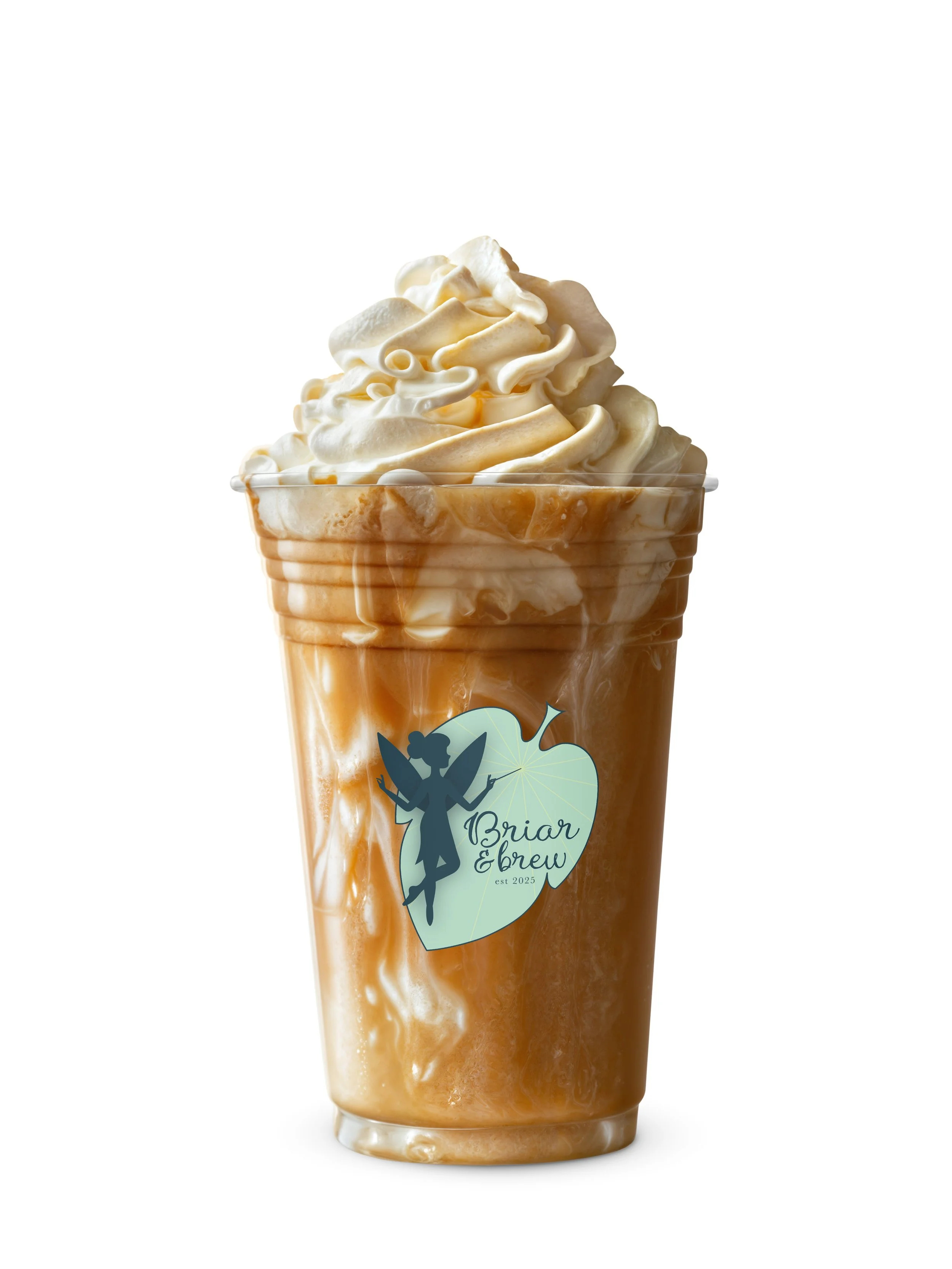
This selection fit with my natural theme and also paired very well with the milky and deep browns that might appear in the coffee and tea.
I wanted the main design element of this brand to be the “mascot” a fairy named Briar.
Briar plays a key role within the branding, being the character responsible for the whimsical elements throughout the coffee shop.
Briar is utilized throughout the design in the logo, the menu, the sign, and on each cup of coffee or tea.

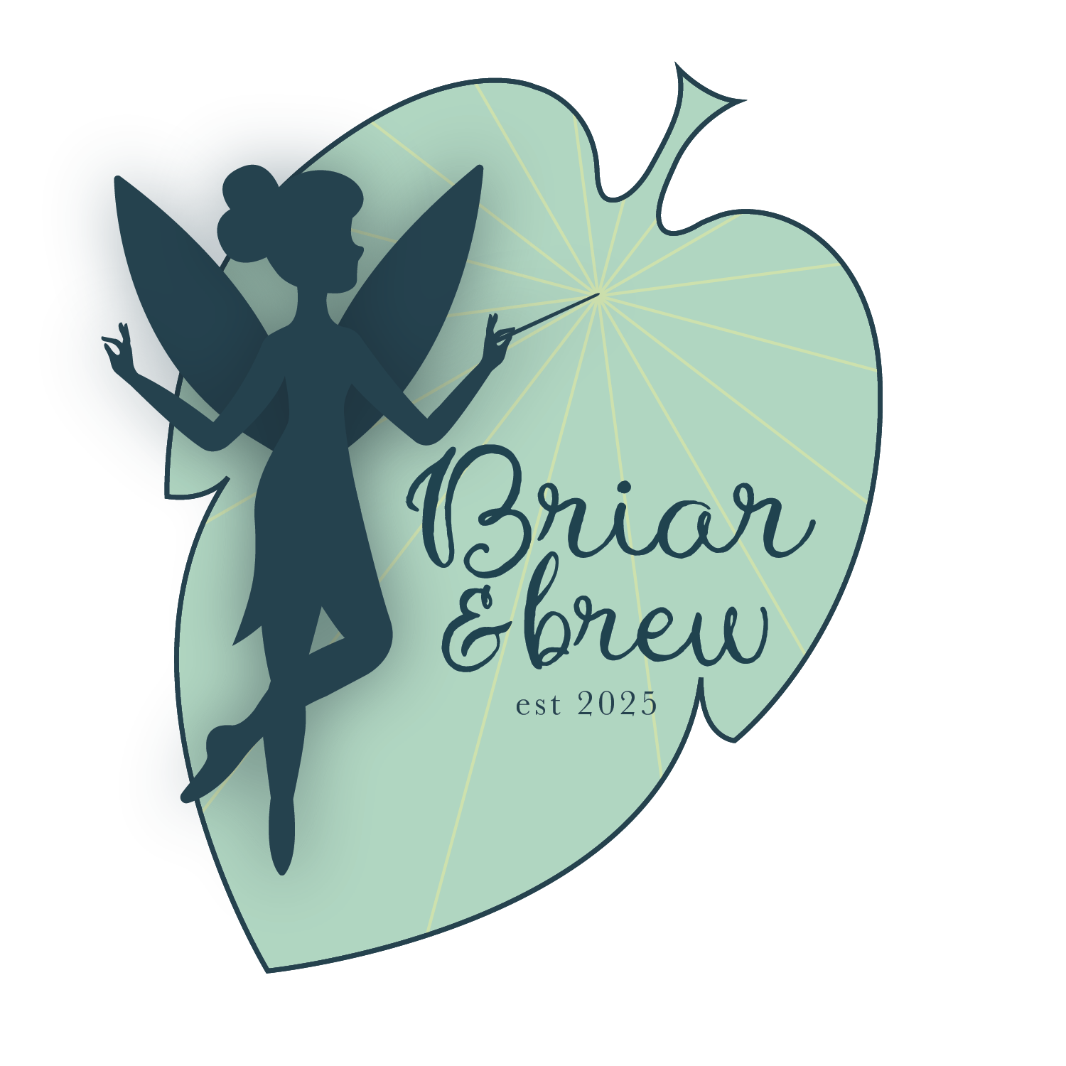
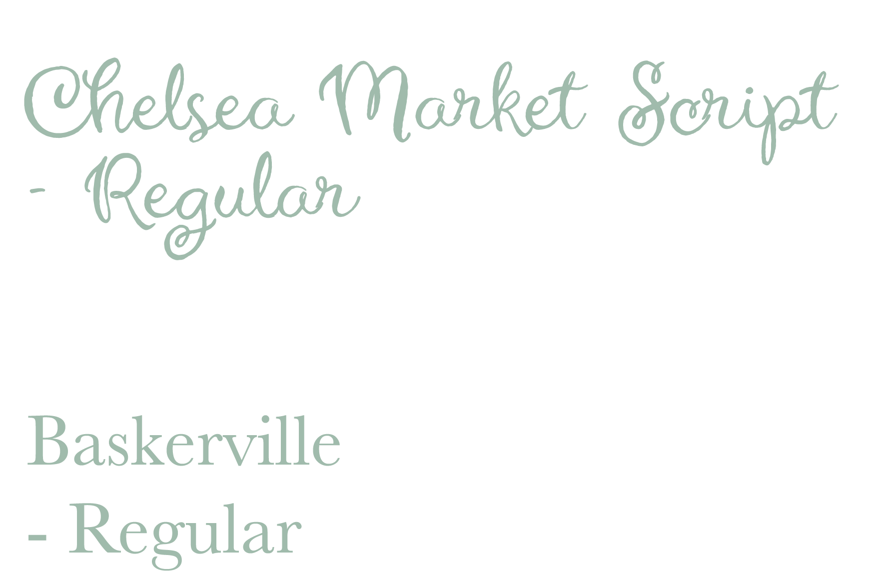
I decided on making the text more whimsical and fun when I decided I wanted the shop to have more personality and whimsy.
I chose Chelsea Market Script Regular as the title font and Baskerville regular as the secondary text font.
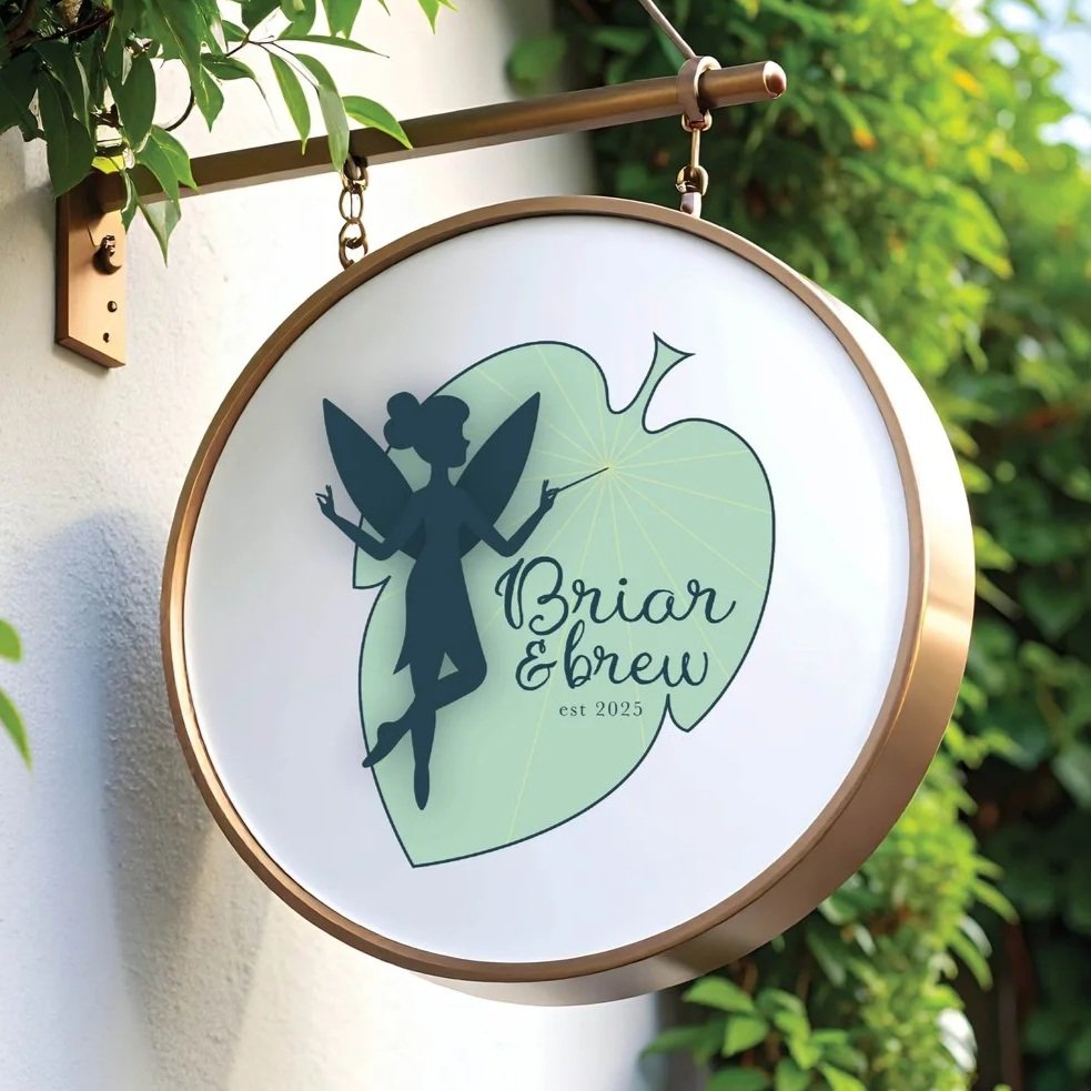
In my final logo I turned from doing the design in a circle to making it in front of a leaf. It felt like it fit my design better and made it stand out.
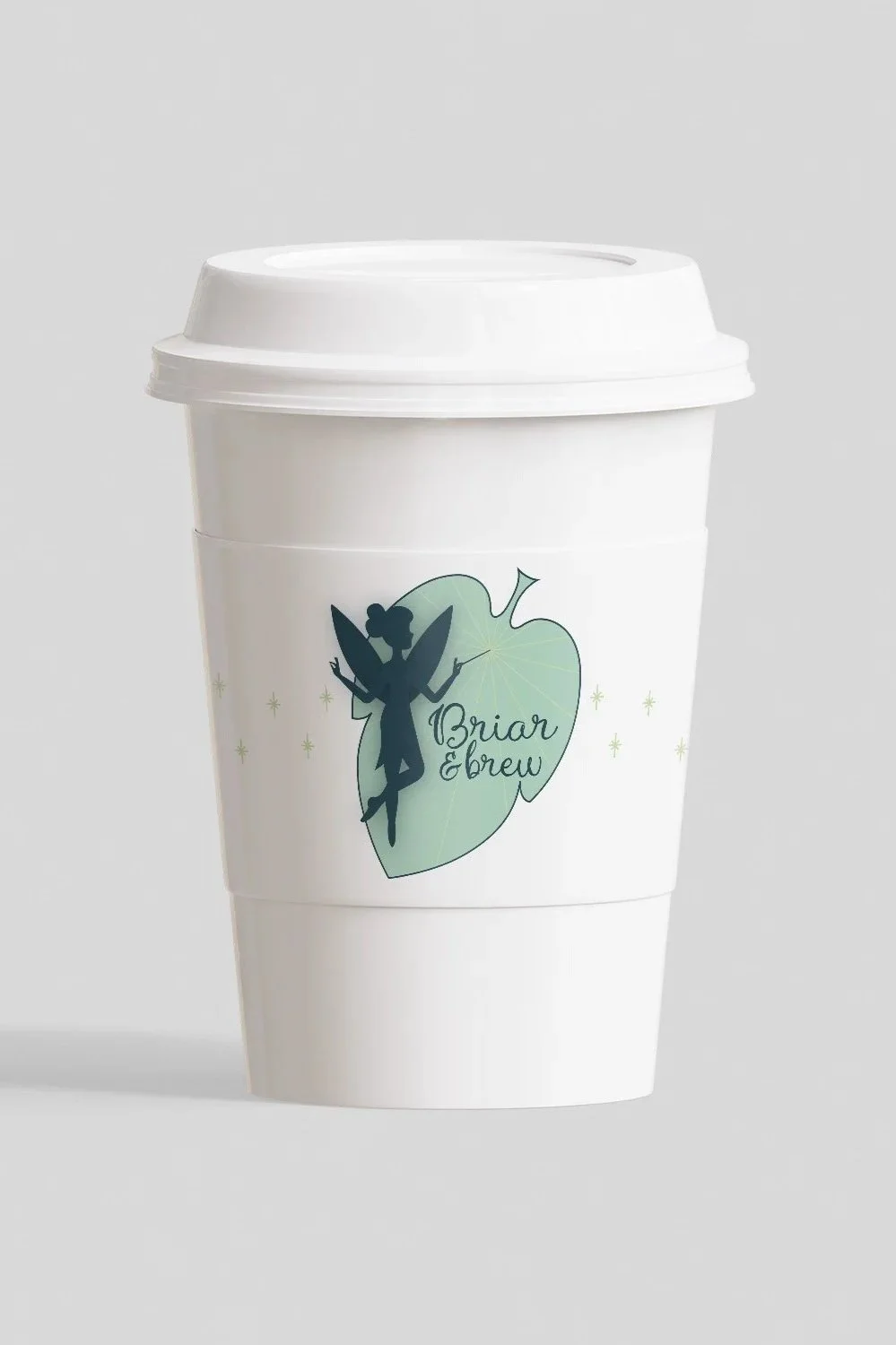
This final logo would be featured on each cold cup and each hot cups sleeve
Elements of this design are then utilized throughout the rest of the companies branding including the menu, the sign, and during the campaign.